
Increasing the reach of Fly Fishing Promotion
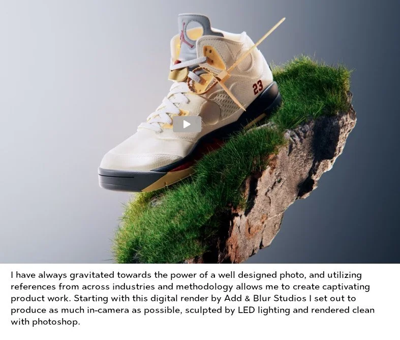
Fly photography, how do you make it truly marketable and interesting to newcomers? Industry standard shots are in a fish’s mouth or sitting on the desk in a group (see below). How do we as the largest manufacturer make people care about our patterns vs knock offs, and get them excited to purchase? We chose to more directly attach them to the inventors of the patterns, tell their stories and how the product helps solve issues in the fishing world. That also meant looking outside our industry for other examples of small, easily confused items ( to the lay person) that are properly shot and cleanly presented. We looked primarily at make up and sneaker culture to push the studio photography to new levels.Looking outside your industry is important. Knowing what your competitors are doing has a lot of weight, but I feel you can create more diverse designs by utilizing pieces that are only related to you in some smaller way. Below is the progression from a rendered sneaker idea found on Behance, looking at another collective culture that has a vast catalog of options, and the need to showcase differences to experts. Next to it is the progression to a real-life version with props and lighting produced in our small in-house studio. Finally, you can see what some time in Adobe Photoshop can clean up to return to that initial floating-in-space look, capturing the fly in something closely resembling the world it is used in, but in a format that breaks out of the desktop mold and grabs attention.


When fighting to breathing room in social media and across the digital landscape, a basic photo of flies just won’t cut it. To that end I worked to bring the connection between our new patterns and the men and women responsible for inventing them. Leaning into our older, typically white demographic gave me the idea to look at baseball cards from the 70s and 80s. They’re a compact format to pass along a lot of information, and it’s in a style that our consumers are likely used to and willing to read. We’ve had immediate and continued success in utilizing this format, and continued it this season with a progression to 90s basketball cards, with more detail in the artwork and more customization with new team logos and icons. The response has been continued, and we’re able to pass along a lot of detail without forcing viewers to look in the comments or move to a different landing page for information.